
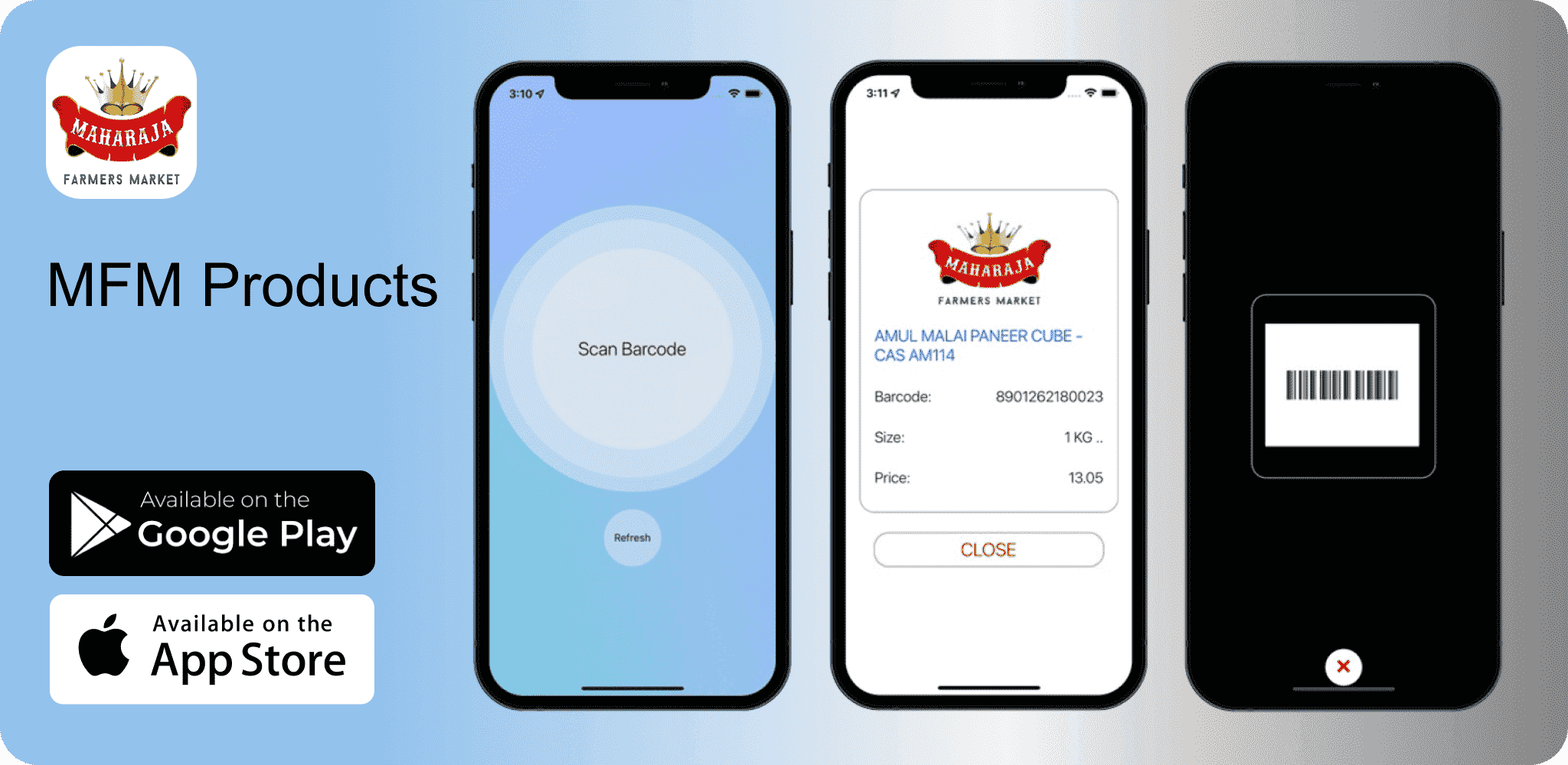
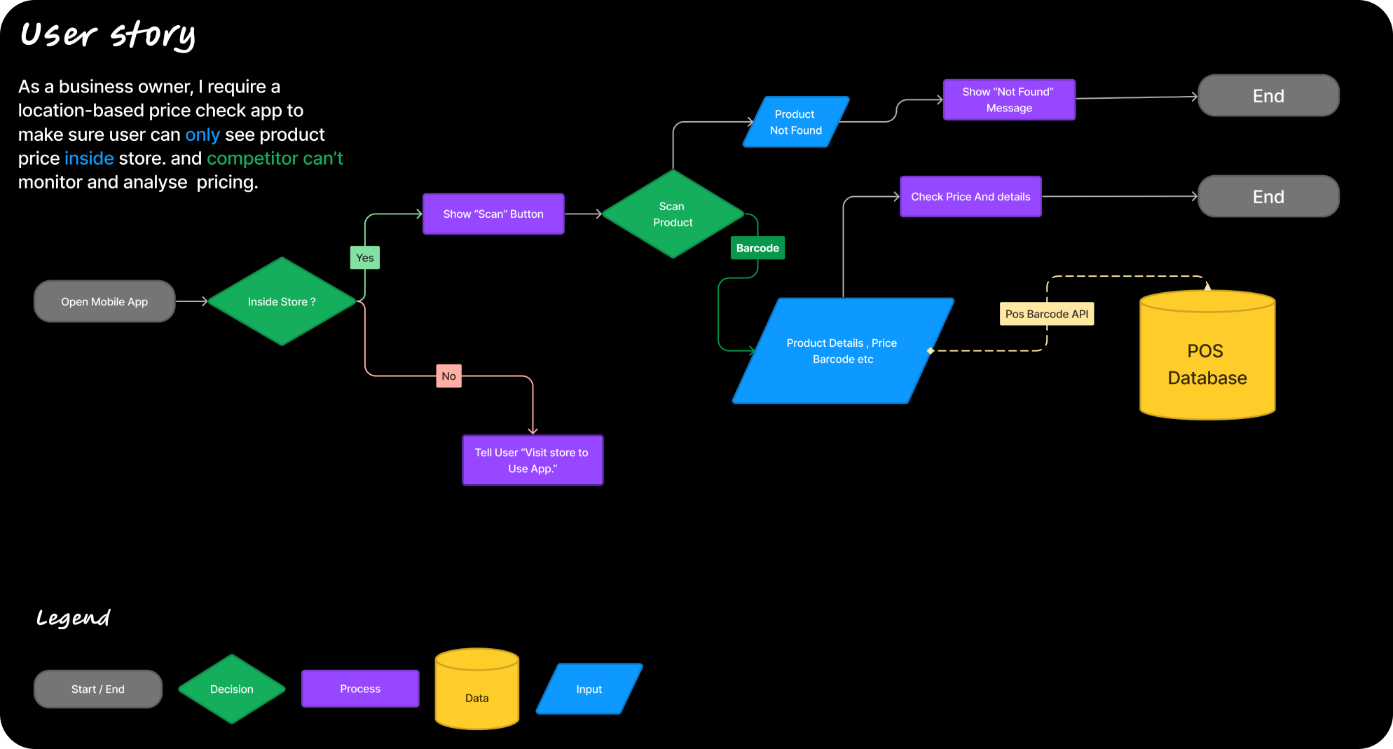
MFM Products is a product-scanning app for Maharaja stores that allows customers to go to the store and scan products to get their latest prices and information.
At the beginning of this project, the features of this app were initially integrated into the store's e-commerce app (a different app). However, later, it was decided to develop it as a separate app. Having worked with location-based apps before, I had a good understanding of what needed to be implemented. So, I decided to adopt a similar approach to what I had used in building other apps. Since the features and app requirements were straightforward, consolidating everything into a single screen made sense.
The first task I had to do was to obtain the user's location. There are
several ways to achieve this, but I opted to use an open-source library
called @react-native-community/geolocation. I chose this library because I tested many other solutions, but for one
reason or another, they didn't work. After trying them all, geolocation
turned out to be the solution that worked.
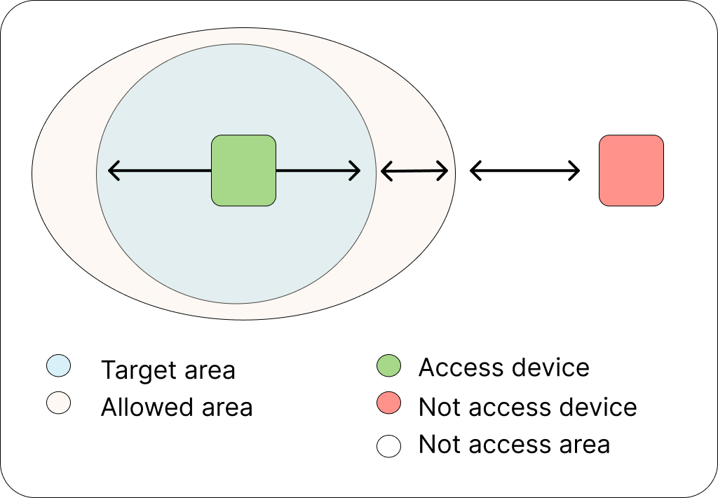
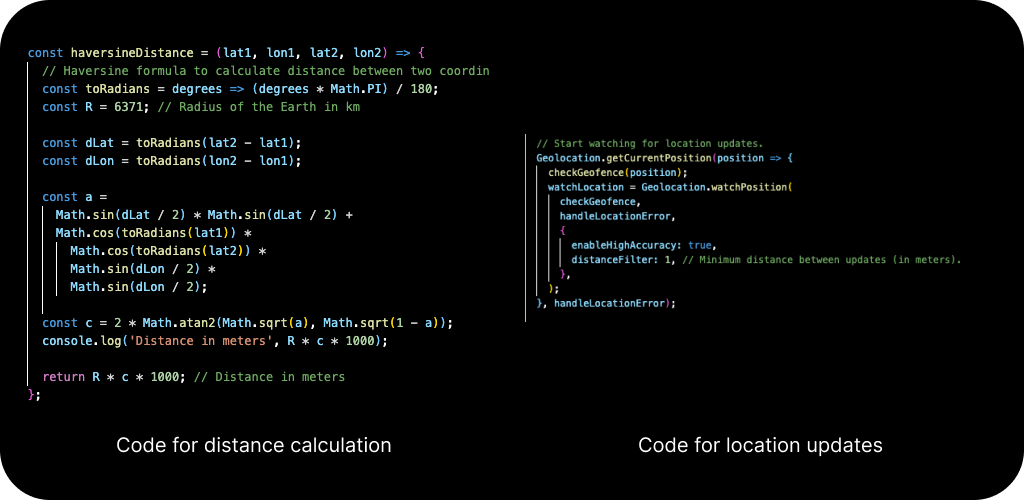
Next, after obtaining the user's location, I needed to determine whether
they were inside the allowed area (Maharaja store in this case). For this
purpose, I used the Haversine formula, which is an equation that can be
used to calculate the shortest distance between two points on a sphere,
such as the surface of the Earth.
The final task was to receive updates for the user's location, which was
also accomplished using the geolocation library, as shown in the code
example below.
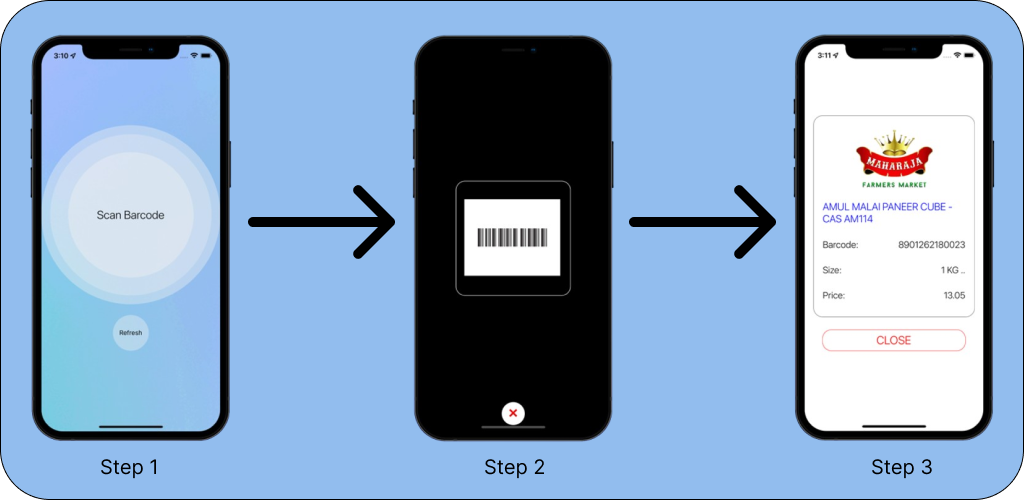
After ensuring everything was functioning smoothly, it was time to enhance the app's appearance. I wanted to proceed one step at a time, focusing on one action per screen. I didn't want to overwhelm users with too many buttons or options. Therefore, I decided to go with a single prominent button on the home screen. Upon clicking the "Scan" button, a scanner opens automatically detecting barcodes, which is achieved using the open-source library react-native-qrcode-scanner. On the final screen, there is a large "Close" button, ensuring users have an easy time navigating the app. The main principle was to follow simplicity and ease of use.
"Good design is as little design as possible"
According to Dieter Rams, good design involves as little
design as possible because it concentrates on the essential aspects, and
the products are not burdened with non-essentials. Back to purity, back to
simplicity.
A good design can speak for itself, without asking the user to commit much
effort.
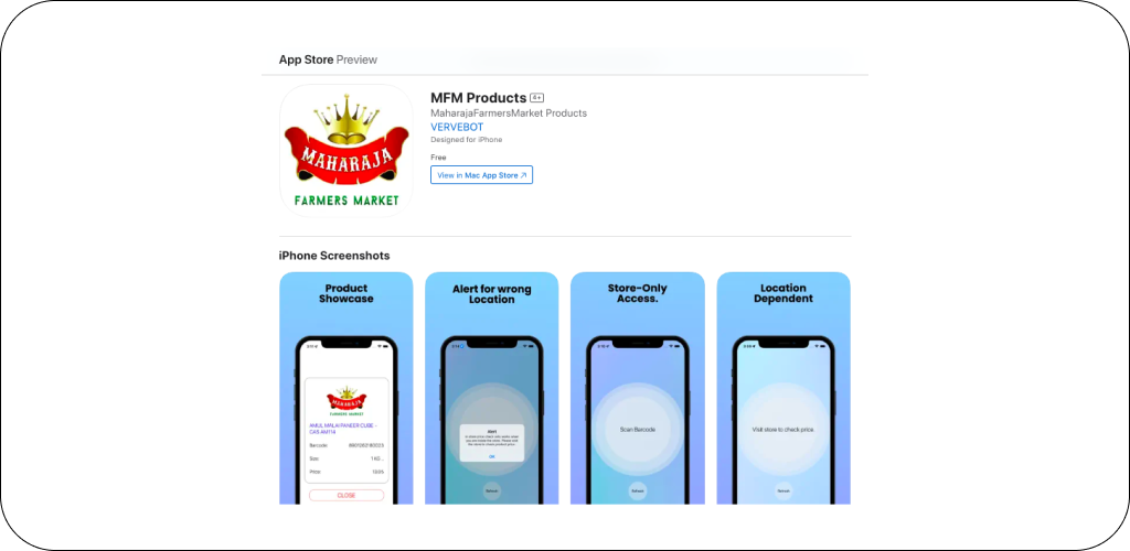
After fine-tuning the features and design, the app is ready for launch on
the App Store. However, upon our initial submission for review, it was
rejected because the reviewers wanted to interact with the app and see
every feature. This posed a challenge because the app is specifically
designed to function only within Maharaja stores.
Solving the App Store review problem: To address this issue, we
created a video demonstrating the app's functionality and showcasing every
feature. After submitting the video alongside our app for review, it
successfully passed the review process. However, to ensure continued
approval, we now attach the video of the app working in every review
submission.
If given more time or resources, here's what I would do: First, I'd
enhance the app to streamline the App Store review process, eliminating
the need for a video submission with each review. This could involve
implementing a comprehensive demo mode within the app, allowing reviewers
to interact with all features without needing to visit a physical Maharaja
store.
Additionally, I would remove the manual refresh button functionality and
automate the process. By implementing automatic refreshes, users can
benefit from real-time updates without having to manually trigger them,
enhancing the app's usability and convenience.
I've built other apps too, like ICMS Scanner, created using React Native. It is an app for internal use only (not on the app store). It was designed to connect and work with the company's internal software.